Extra Research – Another Idea I Had

From my music and photography interests I came up with the idea of incorporating two scenes together. This is something that I had seen in Gregory Crewdson‘s work.

Here in his series Brief Encounters he looks at sleep problems and incorporate it with behavior people may take up such as gardening when sleep walking. Through this he incorporates a garden into his images which are set in someone’s home so it becomes a garden and a bedroom, kitchen etc at once.

However, I wanted mine to be based on an estate so that was the backdrop then the home furnishings would be placed inside the area. This made me think of Stereophonics, Keep Calm and Carry On album booklet.

IMG_0008

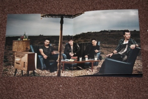
In this the band are situated in a coastal area and in the ocean itself here they are sat in the water around a table familiar to a small cafe as well as sat around a table, watching TV that is familiar to a home or dressing room. This is to show how the band travel to all different places throughout the world and could be situated anywhere yet where ever they go they make themselves feel at home. By watching certain TV programs or having other interests such as their other bands work with them. (Shown through the front of the radio there is a red, black and white piece familiar to that of the back of Adam Zindani’s band Casino‘s album).

This is how I imagine my imagery turning out however instead of being in a coastal area it will be based in a council estate with the images of actual furniture from my home being photo-shopped in so to merge two images to create one. Making it a room of a house is located inside the estate. Showing the rough side of the estate but how it is people’s homes.

Bibliography

History of Coventry

Coventry City Council (2013) Local History and Archives [website]http://www.coventry.gov.uk/
Lambert, Tim (2013) A History of Coventry by Tim Lambert [website] http://www.localhistories.org/coventry.html

Youtube (1981) Ghost Town by The Specials [music video] http://www.youtube.com/watch?v=1WhhSBgd3KI

Coventry City Council (undated) Welcome to Coventry Mini Guide and Fold Out Map of the City [leaflet]

Google (2013) Google Maps [website] https://maps.google.co.uk/


History of HillFields

Coventry Observer Newspaper (2013) Coventry Observer [website and newspaper] http://www.coventryobserver.co.uk/

Google Search Engine (undated) Google [website] https://www.google.co.uk/

Coventry Society (2013) Hillfields [website] http://www.coventrysociety.org.uk/coventry-neighbourhoods/hillfields.html

Artist Research

Demoix (2013) Hygate Estate a Starkest Examples of Post-War Urban Decay In London by Velar Grant [Image-sharing site] http://www.demotix.com/node/2174726

Noupe (2010) 50 Stunning Examples of Urban Decay by Aquil Akhte [blogging site] rhttp://www.noupe.com/photography/50-stunning-examples-urban-decay-photography.html

Fenton, Steve (2008-2013) Urban Decay and Graffiti [website] http://www.stevefenton.co.uk/Content/Gallery/Image/Urban-Decay-And-Graffiti/

Deviant Art (2009) Urban Decay -04 by Scotto [Image-sharing site] http://scotto.deviantart.com/art/Urban-Decay-04-113517014

Flickr(2010)Urban Decay 5/52 by Smarthair (on the bike) [Image-sharing site]http://www.flickr.com/photos/48746351@N03/8426922728/

Photo Ready (2007) Abandoned Building by unknown [Image-sharing site] http://www.photoready.co.uk/scenes/urban-decay-2.html

Found Images

Coventry Telegraph (23rd June 2011) Council Wages War As People Dump Rubbish in Coventry Streets [Online and Newspaper] http://www.coventrytelegraph.net/news/coventry-news/council-wages-war-people-dump-3042928

Coventry Telegraph (23rd April 2012) Coventry Launches Alcohol Awareness Campaign to Cut Harmful Home Drinking [Online and Newspaper] http://www.coventrytelegraph.net/news/coventry-news/coventry-launches-alcohol-awareness-campaign-3026706

Coventry Telegraph (16th May 2013) Illegal Pool Hall From Hell in Hillfields is Finally Snookered [Online and Nespaper] http://www.coventrytelegraph.net/news/coventry-news/hillfields-coventry-pool-hall-loses-3860579

Coventry Telegraph (31st October 2012) UPDATE WITH PICTURES: Arsonists Torch New Coventry Hillfields Restuarant Week Before Due to Open [Online and Newspaper] http://www.coventrytelegraph.net/news/coventry-news/update-pictures-arsonists-torch-new-3018861

Coventry Telegraph (4th October 2013) Video: Cops Renew Call For Help To Track Down Driver Involved In Horrified
Hillfields Hit and Run Captured on CCTV [Online and Newspaper] http://www.coventrytelegraph.net/news/coventry-news/video-cops-renew-call-help-6139303
Coventry Telegraph (6th October 2006) Tackling The Seedy World of Vice [Online and Newspaper] http://www.coventrytelegraph.net/news/coventry-news/tackling-seedy-world-vice-3120393

Coventry Telegrph (4th April 2013) Coventry Man Banned from Every Library in The City [Online and Newspaper] http://www.coventrytelegraph.net/news/coventry-news/coventry-man-banned-every-library-3012518

Coventry Observer (16th August 2013) Sickening Attack on Coventry Pensioner by Steve Carpenter [Online and
Newspaper] http://www.coventryobserver.co.uk/2013/08/16/news-Sickening-attack-on-Coventry-pensioner-81381.html

BBC News (25th September 2007) Fire At City School is Suspicious [Online and Television] http://news.bbc.co.uk/1/hi/england/coventry_warwickshire/7012958.stm

McGeechan, Andrew (7th May 2013) Hillfields Shops, Coventry, May 2013 [Online] http://www.flickr.com/photos/andymcgeechan/8721591228/

Coventry Telegraph (October 2013) Paul Stacey House, in Bath Street, Coventry, where a man fell from the third floor [Online and Newspaper] http://www.coventrytelegraph.net/news/coventry-news/replay-coventry-warwickshire-news-wednesday-6105820

Presentation

The Photobook  (1st October 2008) Robert Frank The Americans [Online] http://thephotobook.wordpress.com/2008/10/01/robert-frank-the-americans/

Frank, Robert (9th June 2008) The Americans [Book] Steidl, Düstere Straße 4 – D-37073 Göttingen

Manns, Thomas & Company (undated) South Southeast by Steve McCurry [Online] http://www.manss.com/en/project/steve-mccurry-south-southeast-phaidon-press

McCurry, Steve (31st August 2000) South Southeast [book] Phaidon Press, Ltd. (London, New York)

McCurry, Steve (2012-2013) Steve McCurry [Online] http://stevemccurry.com/

Dakowitz, Maciej (2012) Cardiff After Dark [Online and book] http://www.maciejdakowicz.com/cardiff-after-dark/

Dakowitz, Maciej (October 2012)Cardiff After Dark [book] Thames & Hudson (London)

hp MagCloud (2007 – 2013) MagCloud [website and book] http://www.magcloud.com/

Extre Research

Crewdson, Gregory (2013) Brief Encounters by Gregory Crewdson [website] http://www.gregorycrewdsonmovie.com/

Casino (2008) Spider Simpson Incident by Casino [website and album] http://www.casinoband.net

Stereophonics (2010) Keep Calm and Carry On by Stereophonics [website and album booklet] http://www.stereophonics.com

Reflection

For my assignment I was asked to create a piece of site specific work based around a map. To be shown through a range of images that held interest to me. For this I chose map 15 and looked at the area of Hillfields, a local Council Estate. This interested me as I was able to relate to it from growing up. For this I decided to look at how the area is stereotyped, through publicity so to get a reputation. Then question how correct this was by comparing it to how the place was when visiting it.
For this I used my Canon 1000D as it was smaller so easier to hide when in the area, followed up with editing the colour and grungy feel known in the area. I decided to not make many changes to keep it honest as it was depicting the area. Finally forming them into a book that held the media’s version alongside my version to draw comparison, creating a diptych..

I liked this project as I felt it was free, being based on what I wanted to do not a set style. I also liked that I was taken out of my comfort zone by working in an area that was unknown to me. However, the part that I disliked was when doing my research I felt put off as it felt  dangerous and the idea of going to the area was worrying. However, I found that the area was not as bad and I enjoyed it.

The only parts I would change of my outcome is in finding better quality archived images. Along with organize my time as the freedom meant other options were put in front. Finally I would think harder about my ideas so to hone in on them so that they were clear when expressing them.

Final Product

Finally I had a final product that I uploaded to MagCloud.

This is my final book. site specific book editted.

This is my magcloud version. http://www.magcloud.com/browse/issue/663873

In this book I have laid out the images in an order that runs consecutively through the theme of all my images being landscape with a white border around them. So to give a framed affect, as this is something that I felt worked effectively in my research. I also preferred the idea of all the images having the same layout as it made it look neater and the viewer would spend more time viewing it than they would if they had to keep turning the book round each time.

As for the order of the images I chose to look at the order of my images. Starting off with a regular scene that you see in many places. Followed by what can cause it like drink. Making me focus on the anti social behavior. Followed up by what is afterwards and how it is tried to be solved so to show this has admittedly happened but not like it recently. Before finally looking at how the area has come to be more of a contradiction to it’s stereotype. On top of this the images are also based as the archived images being of the right for how it is seen, so they are the first image to look at when viewing them when giving a timeline order. However, when you turn the page to view the images that is not the impression you get from the area like any other.

As for the text I feel is is best located at the bottom as it was in the Robert Frank, The Americans photobook as this gives more of an exhibited feel to the image. As I feel my images may also work as an exhibited piece but maybe in a larger collection and not just based on this project.

For this piece I decided I want to keep my book as a digital piece as I feel it could be part of a larger piece as a suggestion made to me when speaking to my lecturer was that I could compare it to my area. Although I felt I wanted to keep this project based in Hillfields due to it being the area I was looking at and I could add extra features such as the home in the community into the project also. Over all I am happy with my final product as it represents my idea of showing that there is good in a bad area and that a bad area is in fact the same as anywhere else. Not some where to avoid but I also feel that this project has a future of being part of a bigger project.

Book Editing

To create my book I used Indesign.

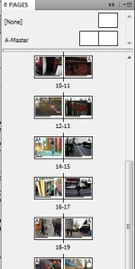
This was created into a book of a range images.

i

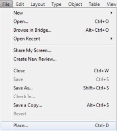
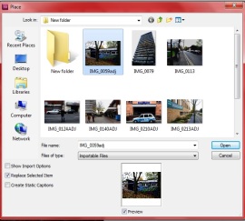
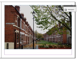
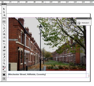
I imported these by File Place and then adjust the size for them to all be the same.

nde

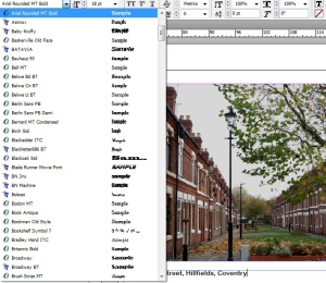
After I applied the text changing the type to a readable font and size that suited the tone of my book. This was

snn

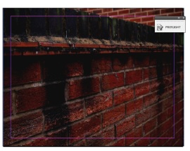
Afterwards I decided to use one of my images as a front cover, making it full size of the page.

n dii

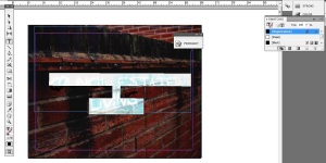
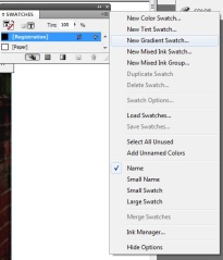
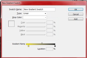
After applying more text I changed the colour of using a new gradient swatch. Where I then picked the linear option and chose two colours for the swatch to run between.

inid ie

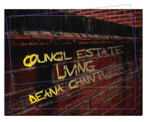
Following on I rotated the text so to put it on an angle to fit the bricks in the image.

1

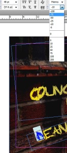
This though didn’t work perfectly so I selected each letter that didn’t fit and points and alignment at the top of the software so to make the text higher or lower depending on what I needed and to bring it in closer to the other text.

11 111

Presentation

While coming up with my idea I just felt as though with this I wanted to form my work into a book. For this I looked at books with different layout.

First I started with Robert Franks – The Americans

In this book the images are split between two pages on one side (the right) you have the text and on the other (the left) you have the images. The images are a full A4 with a narrow white border at the top, bottom and the outside on the right. One the inside side you have the image running into the binding. While on the left page where you have the text, the text is based at the bottom as a one line piece of text. That gives detail about the image being based on a title. This is also on a white background, like the border and has small writing. The white paper also contrasts with the images and text which are all in black and white.


Another book I looked at was Steve McCurry – South, Southeast

With this book by Steve McCurry it is based in three different layouts. The book is landscape A3 size. It consists of images being placed on the right side with the text centered in the middle of the page on the left. While for portrait, they are set so the book is portrait with the text center in the middle of that page. This is throughout the book except for on the first page for the text about the book where the text is located as landscape at the bottom of the page. The images also have a white border around them, which is twice the size at the top and bottom as to the border on the side. The text with this is also only based on the place and year captured.

From my essay I looked at the outline of the Cardiff After Dark project by Maciej Dakowitz whose style of book I found interesting.

For this book the images were all based as landscape images. Here though the images were split between two styles of either two images set with a large white border with the text in black aligned left otherwise on a page of their own with a blank black page on the left and a full page image on the right. While the text was aligned in the same place but is white instead. The change of image types depends on how much of a focus is in the image as if the focus is the only part of the image then it is on a larger page to make it stand out as the focus is clear. While with the images that have extra context they are made smaller so to make you look in closer.

Finally I also looked at doing my book as a pdf through MagCloud.

Here I can have a book visually available where ever I am and create it simply myself from start to the end with control with the final look to it. Through this way I am also able to have my book as a presentation also so to covers more than one publicizing style.

Presentation Ideas

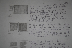
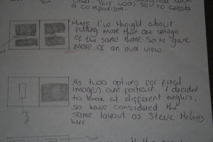
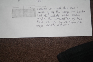
For my layout I have come up with a range of 5 different ideas due to my research. With these I considered what was the most important to show, so that they were the main focus in the size. These are my ideas.

IMG_9821 IMG_9822 IMG_9823

Out of this I have decided to go for the second option this is due to it being the neatest which represents a good tidy theme for the images. Alongside the fact that they are the same size and alongside each other also makes them easier to compare. So to see the way in which and area like Hillfields is publicized in comparison with how the area actually looks and is to people who live in that area. The layout also gives the impression of what my images would look like if they stood alone on their own instead of in a diptych, so to look as if each image has been framed with a white border.

Final Images

Afterwards I had my final images from this.

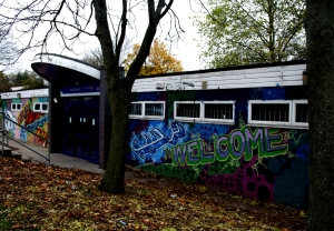
IMG_0059adj

In this image I focused mainly on the graffiti as it was a building that stood out due to being covered in it. However, due to where it was located the place was hidden and the only piece that littered the area was the fallen leaves. The graffiti though did not mess up the area but instead added to it being welcoming due to the words written on it.

IMG_0113

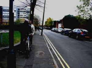
In this image I focused on the friendly chat of two people who were parting ways at the corner of Wellington Street. Except for that the road is empty with the exception of passers by. Showing that prostitutes do not stand on the road all the time as what Hillfields is known for. Instead it is just a typical road like any other.

IMG_0124ADJ

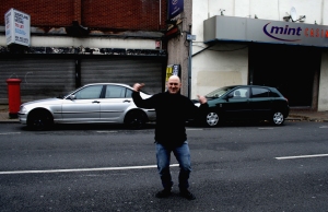
Where as in this image I captured an image of a guy who wanted his image captured. This I feel showed the response of the way people reacted to someone walking around with a camera. Showing more of a friendly approach as compared to the hostile approach usually shown.

IMG_0210ADJ

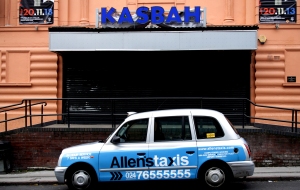
A common scene shown in many areas is the use of too much alcohol. This is usually followed by rubbish being on the floor from the takeaways following, sick from to many people drinking. However, in this image there is no sign of the drinking that happens inside the place the night before or the other nights before that. The image contradicts the known scene shown.

IMG_0140ADJ

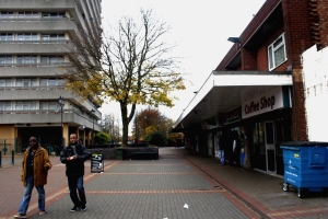
In this image you see a common image shown for a council estate with the open area, a tower block in the back and a group of kids outside a shop. In this though they headed into the shop to do shopping and then headed off. Not hung around scaring the elder generations.

IMG_0213ADJ

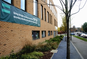
Something else for the area is that it is always represented that a rundown area has little hope of doing well with education. With this the education banner shows this is not always correct.

IMG_0262ADJ

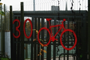
Also high for the area is that of speeding, a place that is seen as a dangerous area for crossing the road. Yet here the road sign asks for a reasonable amount of driving and emphasizes that there is a high amount of bikes in the area and although there are quite a few cars. The amount of bikes are also high.

IMG_0303

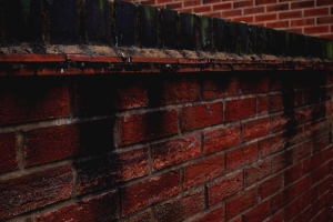
This also shows the aspect of a fire that happened and the remains but at the same time it is hidden at the top of the wall looking as if it is part of the affect of dirt but also portraying the history that is involved in. Replication the area where the items caught in the fire lay yet how they are not there now.

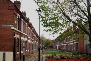
IMG_0321 Finally showing the rubbish in the area that is expected, what is seen of rundown and rubbish everywhere. Instead here you get an elegant look to the area, a council area but is neat and tidy not the litter everywhere as expected.

Editting

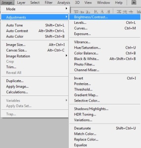
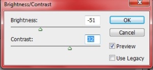
After photographing I found that my images were to saturated to how I wanted them to be as even though I wanted the area to be shown in a good light through my images. The area was undeniably still grungy due to this I decided to lower the amount of colour. I did this by using the adjustments so to lower the brightness and heighten the darkness of the colour. While making the colours work well with each other.

ed

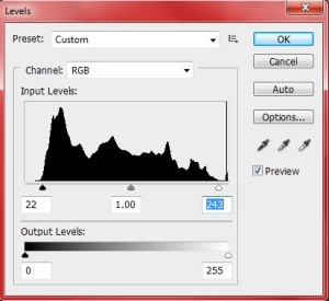
Next I altered the levels through moving the arrows so that they were inline with the graph. However, with some I also moved them further in so to give the image extra darkness.

ti

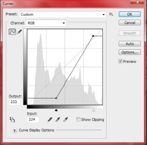
Afterwards I used the curves graph so to alter how I wanted the darkness fell on the image so to make it most effective in my images. Here the alterations meant the darkness was made extra dark while the light area was made to be perfect white but with how I altered it meant I could still include the grungy feel.

ee

dd

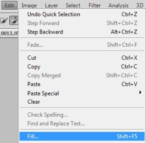
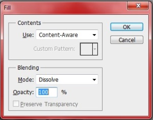
Finally I selected areas that I didn’t want in the image and content aware-ed them through edit and fill. This was mainly due to Kerrie being caught in the background and her camera was clear.

ii 00000

This gave me my final images.

Research Impact

From my range of images though I found that when viewing them my research was key. This was due to it making the area familiar to me so that I knew where I was going. The use of colour and simplicity of the content was also clear as instead of my images becoming highly grungy it instead had a high saturation as many images in my research did. Although they did also include a grungy look alongside this. On top of this my research also meant that I knew what I wanted to capture in my images as to create the diptych I had to have select images that was of the same basis as the found images.  The main part that my research that affected me though was the fact I was nervous going to the area as it was said to be dangerous and I thought I would be a prime target due to the fact i’d have my camera with me. However, instead I found that I had no problems with walking around the area with my camera on show and the only responses I got about it was based on take my picture, take their picture or asking what I was doing.